TomTom Documentation Website
Enhancing a technical buyer journey of the world-leading location tech company
TomTom, headquartered in Amsterdam, specializes in geolocation software, collaborating with companies such as Uber and Volvo to deliver high-quality mapping and navigation experiences. With a strong focus on a product-led business model, the company aims to reduce reliance on manual, project-based services by shifting toward scalable digital solutions.
& Designer

Background
As part of the initiatives for the scalable digital solutions, TomTom recently has been laying a strong focus on online platforms such as marketing or documentation websites, that showcase the product offerings, enabling customers to discover, evaluate, and integrate products more efficiently.
Problem
The existing documentation website is outdated and difficult to navigate due to the large scale of the product portfolio. The team saw an opportunity to improve the first-time experience for potential and onboarding customers by addressing these problems.
Target Group
Product managers were included in the research as a target group alongside developers. Although PMs are commonly not primary users of the documentation website, prior research shows that they use it as a resource during the pre-purchase evaluation stage.
Research
The research consisted of in-depth interviews with 5 developers and 5 product managers, with a range of experience and knowledge levels in location technology, from low to high. Usability testings were used during the research to understand their needs and pain points when using TomTom's documentation website as a first-time visitors.
Insights
Below is the 4 key insights extracted from the research. For more information, please check out the .

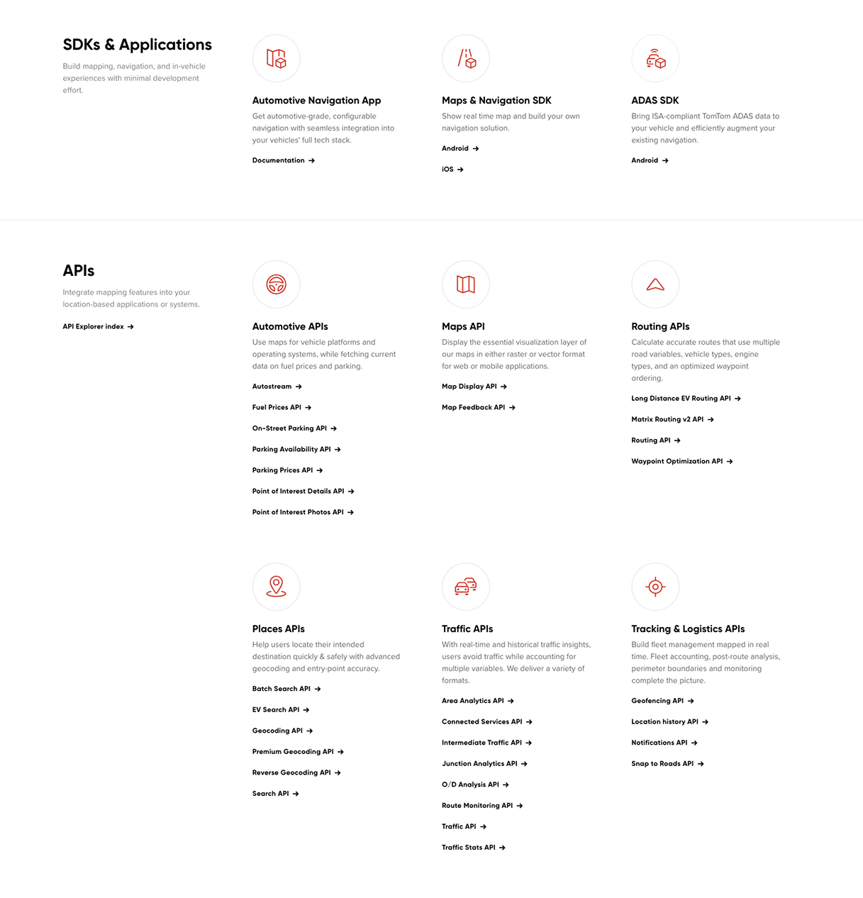
The current documentation site does not answer the key question first-time visitors have: “Which products do I need to solve my problem?” While users are presented with a wide range of product offerings, the connections between them are unclear. As a result, users struggle to narrow their focus to a relevant set of products and can easily feel overwhelmed or lost.

First-time visitors percieve current docs website as a ‘high-level glossary’ of product specifications for those who are already familiar with TomTom products. At this stage in their journey, they want to get a clearer sense of what the products are and how they fit together, rather than jumping straight into detailed “how-to” usage guidance.

Heavy use of industry-specific jargon further increases the difficulty for those who are not familiar with geolocation technologies. Users specifically noted the absence or low discoverability of resources such as starter guides, demos, and blog, which negatively impacts their ability to get oriented.

Technical users strongly prefer learning by doing. Long blocks of text in the documentation require too much time and effort; they would rather dive in, experiment with code, explore product functionalities, and see firsthand what the outcomes would look like.
The current user journey makes users to follow a static, one-way path to get to the goal, with several blockers in each steps making users feel exhausted and overwhelmed.
Ideation
Through co-creative sessions and brainstorming, key design directions were defined. These were visualized in wireframes and iterated multiple times through design critiques with the team and stakeholders.
Updated Homepage Per Section
Through co-creative sessions and brainstorming, key design directions were defined. These were visualized in wireframes and iterated multiple times through design critiques with the team and stakeholders.
A refreshed menu bar enables visitors to quickly discover and access key resources such as the API Explorer, demos, and blog. Highlighting an interactive demo snippet in the hero section adds dynamic visuals while sparking visitor interest.
An updated product section that helps visitors quickly grasp product use cases by product group through clear mockup imagery of final outputs, while providing flexible viewing options tailored to their preferences—reducing the overwhelm caused by long product lists and excessive scrolling that lead to visual overload.
The bottom section of the page enables users to discover additional content and resources to further explore the products, such as clearly presented success story cards and direct access to the API Explorer.
Future Vision
Informed by research insights, these solutions outline a compelling future experience, with implementation planned beyond the short term due to practical constraints.
Guided Entry
Users feel lost and often have difficulty orienting themselves when they first land on the documentation homepage due to the lack of a clear starting point.
The Get Started page provides a guided experience with curated starter resources, helping users quickly understand TomTom's product offerings and feel confident in their first steps.
Problem-Led Exploration
During the discovery phase, users come to the site with a specific problem to solve, not with predefined products in mind.
The Solution Finder is a dedicated tool that helps first-time users quickly understand the available products, what they can build with them, what to expect, and what is required, by presenting this information through preselected popular use cases.
Smart Discovery Assistant
First-time users have many questions, and finding answers by reading through documentation takes significant time and effort. The existing search and AI chatbot see low adoption and provide limited support during early exploration.
A search experience with an integrated AI assistant creates a seamless early-learning journey. By surfacing preselected, well-timed prompts, it sparks curiosity and helps users ask the right questions at the right moment, making exploration intuitive and engaging.
Research Archive
Methodology
I conducted a qualitative study over a 3-week period to understand the early stage of technical buyer journey for TomTom's documentation website.
- 10 in-depth interviews (60 mins each)
- Participants: 5 Developers, 5 Product Managers
- Location: Online, Europe and UK
- Platform: UserTesting.com
- Structured interview quesions and scenario and task-based usability testing on the existing portal
Key Detailed Metrics
Key Pain Points
"Search bar is prominent; I am surprised this is the first thing they have. I'll skip it for now"
Page analytics indicates that the section was exposed to 99% of the first-time visitors, while only 6% of them clicked on it. It implies that the search bar does not work as a primary tool for a navigation for first time users.
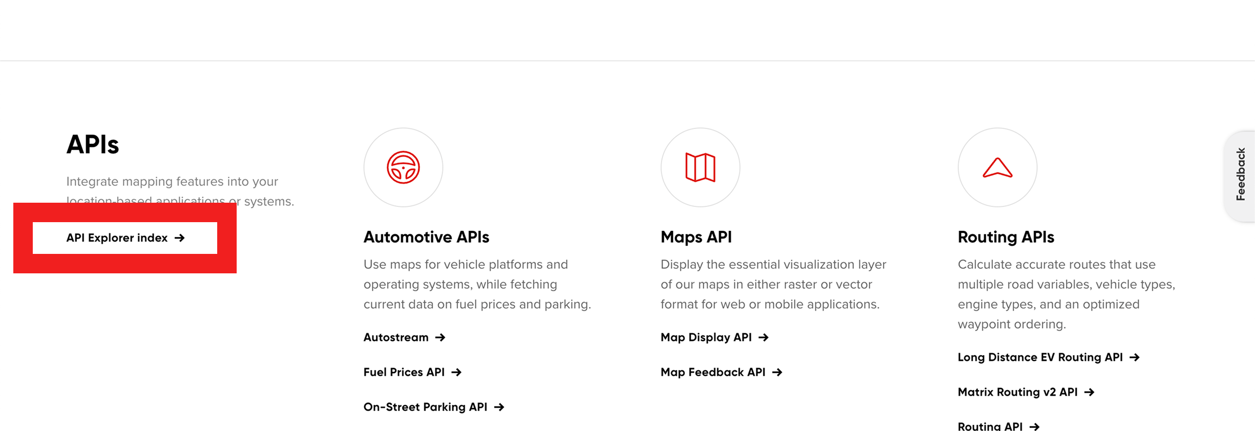
"API Explorer is 'hidden' whereas I would like to see it first."
"I think right now, It's a little bit harder to sort of see that connection (between products) right off the bat, because you're almost overwhelmed at this point."
"I think testimonials always adds a little bit more validation, especially if you're trying to convince another team or your own team."

Despite the existence of entry to testimonials (by clicking the company icons), none of the participants noticed.
"It's quite long... it's not ideal, I would rather go to the API explorer to look a bit deeper into it"
Key Target Audience Needs
Contextual Information
Educational Contents
Sandbox
Step-by-step Guides
Confidence
Insightful User Behavior
Keyword Search
Limited Scroll